Pricing section examples
9 pricing sections from real websites, picked by hand, each with a note on what it does well.
Updated
A pricing section has one job: to let someone work out what they would pay, and for what, without leaving the page. The price is the easy part. The hard parts are the choices around it: how many plans, which one to push, monthly or yearly, and what to show when the price depends on use.
These are the pricing sections we keep going back to. We picked them from the sections in  regards, which come from 360+ websites chosen for how they look, and sorted them by the move each one makes: one plan and one price, tiers with one picked out, and a control the reader moves to find their price.
Each screenshot opens the site’s page on regards, and each note says what to take from it. To find more like one, search for it the way you would describe it: what it shows, how many plans, the colour, the mood.
One plan, one price
When there is one thing to buy, the section can be a short list and a button. These make a single price feel like a decision already made.
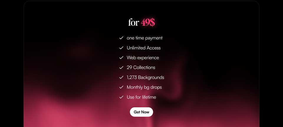
Backgrounds Supply backgrounds.supply ↗
A serif “for 49$” with the number in pink, seven ticks underneath and one white button, over a red glow rising out of black. A one-time price, said once.
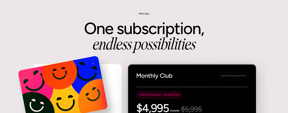
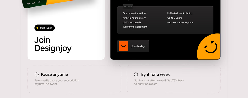
A bright membership card of smiling faces leans out of its frame beside a black card with the monthly price and the old one struck through. Two tiles below answer the worries: pause anytime, try it for a week.
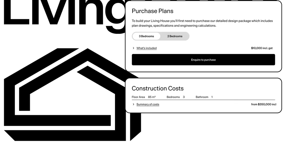
A house design sold like a product: the plans’ price with a two- or three-bedroom switch, then a second card for what it costs to put up, laid over a giant black drawing of the house.
Tiers, with one picked out
Two or three plans side by side, and one set apart by colour, an outline or a glow. The eye goes where the business wants it to go.
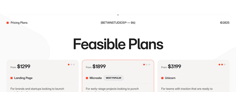
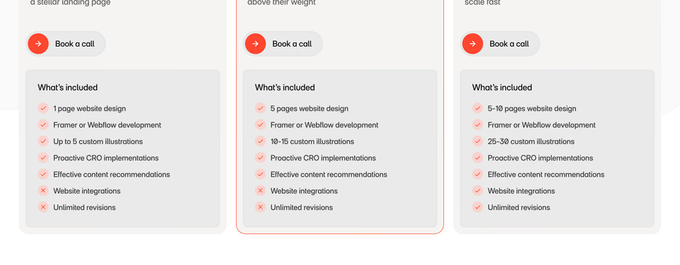
Betwn Studios betwnstudios.com ↗
Three plans named like projects, the middle one outlined in red and marked most popular, with one to three red dots in each card’s corner for how big the plan is.
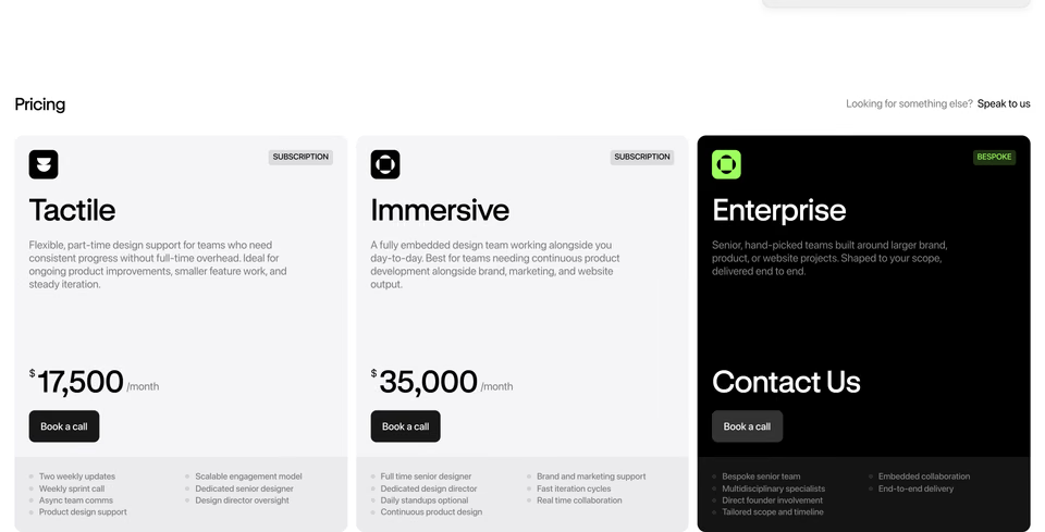
Two grey cards with their monthly prices set huge, then a black card that gives no price at all, only “Contact Us” and a lime-green mark. The top tier is the one that looks different.
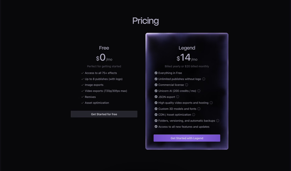
Unicorn Studio unicorn.studio ↗
On black, the free plan sits flat on the page and the paid one glows in a frosted violet card with a violet button. The difference is light, not size.
A control that sets the price
When the price depends on how much you use or how you pay, a switch, a slider or a picker lets the reader find their own number instead of reading a table.
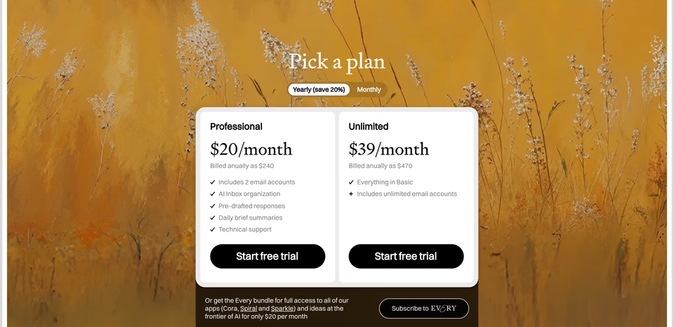
A serif “Pick a plan” on a painting of golden grass, a yearly or monthly switch that names the saving, and two white cards with black buttons. The painting makes a price table feel warm.
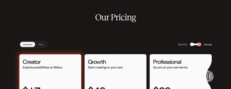
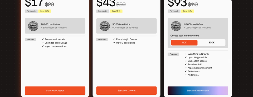
Two switches at once (individual or team, monthly or annual), struck-through prices with yellow savings tags, and a credits picker on the top plan, all on a dark dotted ground.
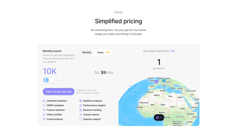
Drag along a row of dots to pick how many events a month you need and the price changes beside it, while a globe on the right shows what that traffic would look like live.
Search for more like these
Describe what you have in mind the way you would to a designer. Every search runs across the whole library.
Questions
What should a pricing section include?
The plans and what each costs, what each includes, who each is for, and one button per plan. Then whatever removes doubt for your buyer: the yearly saving, a free trial, “cancel anytime”, or a calculator when the price depends on use. Many keep each card to a few lines and link to a full comparison or a cost calculator for the rest.
How many pricing tiers should you have?
As many as your buyers really differ, and rarely more than three. The sections here use one plan (a single product or a subscription service), two (free and paid, or standard and premium) or three (small, larger, and a custom plan for big teams). Most of the three-plan ones set one apart, so the reader isn’t left comparing every line.
Should a pricing section show monthly and yearly prices?
If you sell both, yes, with a switch rather than two tables: one price at a time, and the saving named beside the switch, as Cora and Melius do here. If the price depends on use, a slider that answers “what would I pay?” does more than either, like the events slider on Visitors.
Where can I find more pricing section examples?
Search regards for the pricing section you have in mind, in plain words: “dark pricing with three tiers”, “pricing with a usage slider”, “single price on a gradient”. It searches every part of the page from 360+ hand-picked websites by how it looks, and your AI agent can search them too, over MCP.