Blog section examples
12 blog and news sections from real websites, picked by hand from the 100+ in  regards, each with a note on what it does well.
Updated
A blog section is where a home page shows what a company has written, or been written about, lately: a few posts, each with a title, a picture and a date, and a link to the rest. It is easy to leave until last and fill with three identical cards, which is why so many look alike.
These are the blog and news sections we keep going back to, from magazines, studios, shops and software companies. We picked them from the 100+ in regards, which come from 330+ websites chosen for how they look, and sorted them by the move each one makes: laying the posts out like a magazine, giving one story the room, making the cards carry the brand, or leading with the words.
Each screenshot opens the site’s page on regards, and each note says what to take from it. To find more like one, search for it the way you would describe it: how many posts, the pictures, the type, the colour.
Laid out like a magazine
Many stories at once, in sizes that rank them. It suits a site that publishes often, and it needs strong pictures to hold up.
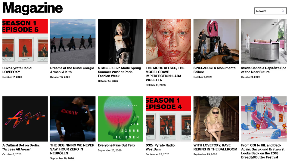
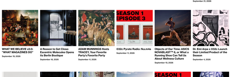
The word “Magazine” in a huge black grotesk over six columns of square pictures, each with its headline in capitals and a date. Red covers for a radio series recur through the grid and mark it without a label.
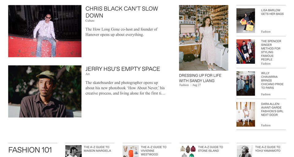
A newspaper front: two big pictures with headlines in capitals and serif lines beside them, a tall portrait in the middle, a narrow column of small stories on the right and a row of A–Z guides below.
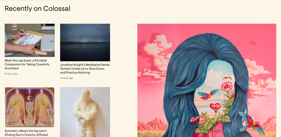
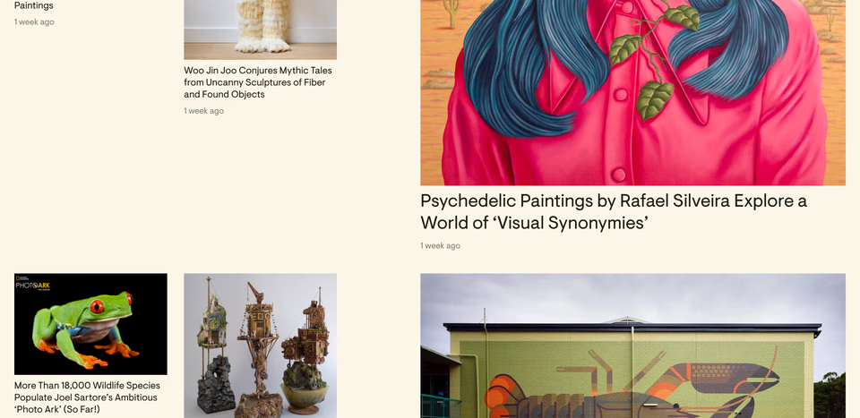
A column of small pictures beside one large painting on cream, then the same again lower down, so every block has a lead story and four smaller ones around it.
One story, given the room
Not a feed but one piece at a time: a large picture, a headline and a line, the way a magazine opens a feature.
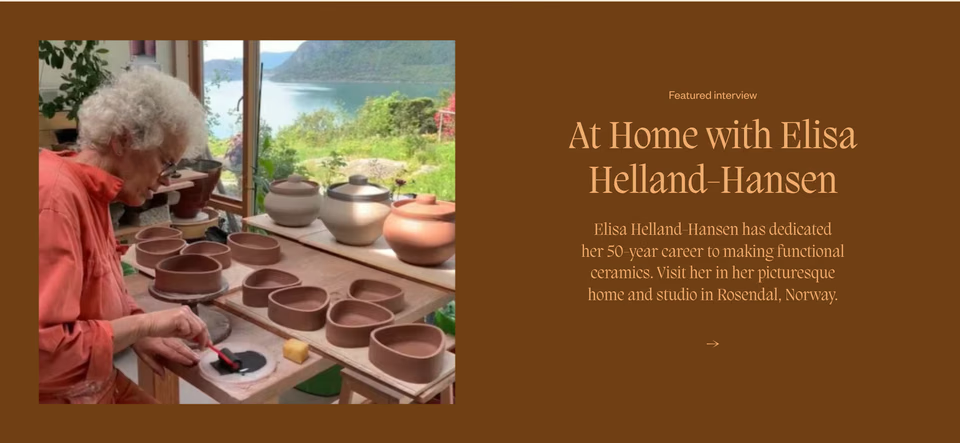
The Vessel vessel-magazine.no ↗
A single interview on a chocolate-brown band: a photograph of a potter at her bench on the left, the headline in a peach serif on the right, a short paragraph and an arrow.
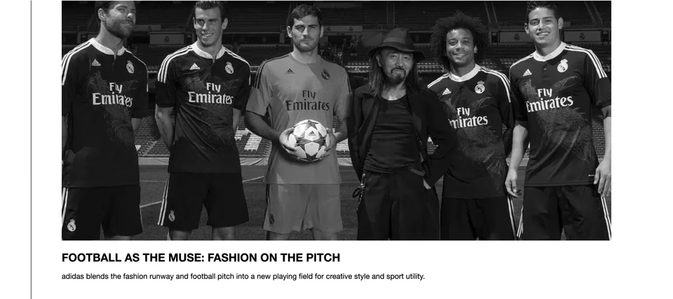
One black-and-white photograph across the column, a headline in bold capitals and a single line under it. Nothing competes with it, so it reads like the lead in a newspaper.
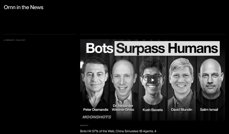
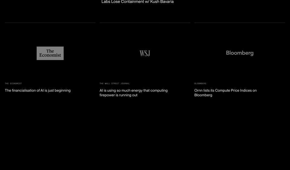
Press on black: one podcast clip leads, large, with a small label in the column beside it; below, three cells hold the outlets’ wordmarks in grey, each over its headline in small type.
Cards in the brand’s own colours
The posts become a row of cards you could tell apart from anyone else’s: the brand’s colours, its type, its way of taking pictures.
-
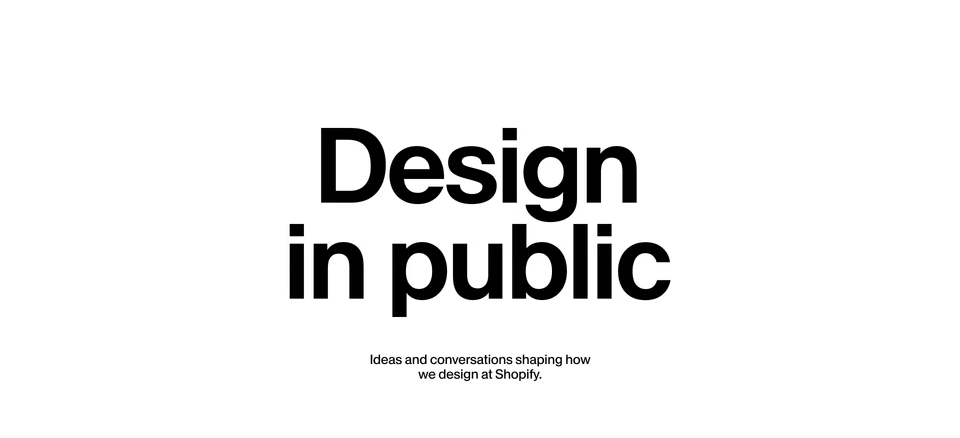
Shopify Design shopify.design ↗
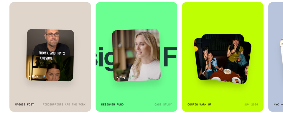
A two-word title in a huge black grotesk, then a row of rounded cards in beige, mint, lime and lavender, each holding a tilted video still with a play button and a caption in monospace capitals.
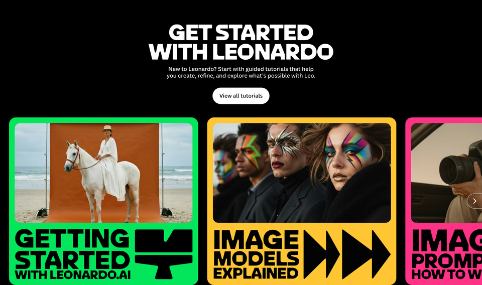
Tutorials as cards framed in green, yellow and pink, each with a picture on top and its title in giant black capitals below, beside a bold glyph: a down arrow, a fast-forward.
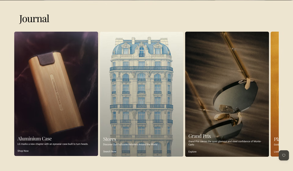
Lunetterie Générale lunetteriegenerale.com ↗
“Journal” in a serif on cream, then tall cards with full-bleed photographs (a gold case on velvet, a drawing of a Paris facade, sunglasses in gold light) and serif titles laid over them.
Lead with the words
No pictures, or nearly none: titles, dates and a line on each, set with care. It suits writing that is read for its ideas.
Preference Model preferencemodel.com ↗
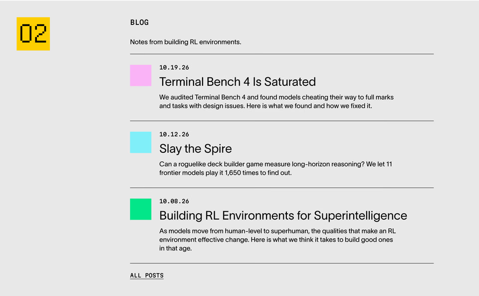
A yellow square with a pixel-font “02” as a chapter number, then three posts in rows, each with a flat square of colour (pink, cyan, green) where a picture would be, a monospace date, a title and two lines.
BOMB Magazine bombmagazine.org ↗
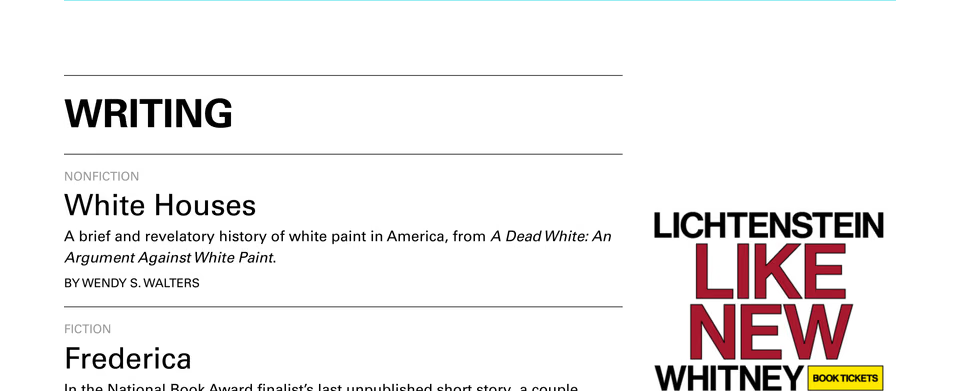
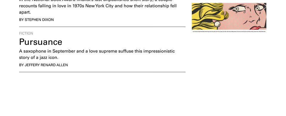
The word “Writing” in heavy capitals between rules, then three pieces as text: a grey label for fiction or nonfiction, the title in a large light face, one line on it and the author in small capitals.
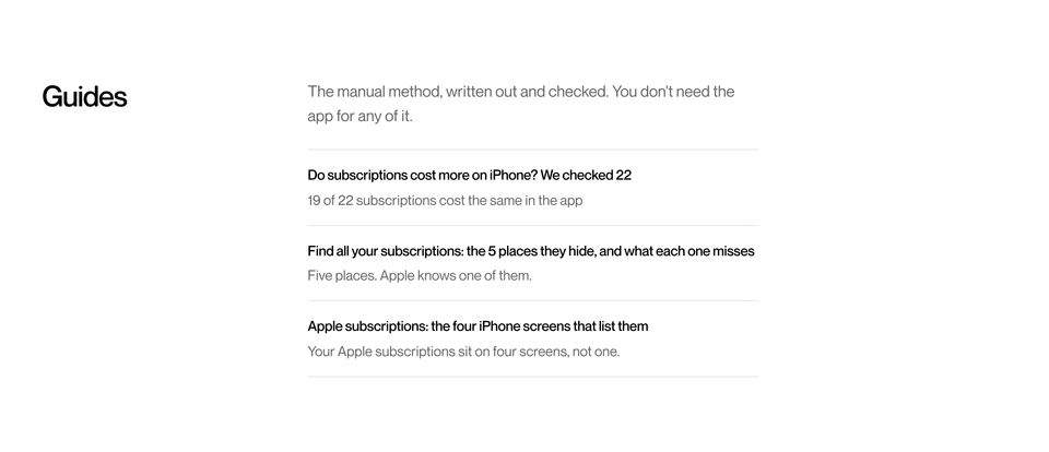
Three guides as plain rows under a hairline each, every title saying what the guide found (“we checked 22”) with its answer in grey beneath. The titles do the work a picture would.
Search for more like these
Describe what you have in mind the way you would to a designer. Every search runs across the whole library.
Questions
What is a blog section on a website?
A part of a page, usually the home page, that shows a company’s latest writing or news: three to six posts with a picture, a title and a date, and a link to the full blog. Studios use it for case-study write-ups, software companies for updates and research, magazines for most of the page.
How many posts should a blog section show?
Three, in one row, in most of the sections here. A site that publishes every day can show a dozen in a grid, as 032c and SSENSE do; one that writes rarely can give one story the whole section, like The Vessel.
Should a blog section have images?
If the posts have strong pictures of their own, yes, and large. If they don’t, a list of titles and dates set well does more than a row of stock photos: Preference Model puts a flat square of colour beside each post instead, and BOMB sets its writing as text.
Where can I find more blog section examples?
Search regards for the blog section you have in mind, in plain words: “magazine grid of articles”, “blog list with dates and no images”, “featured story with a large photo”. It searches 100+ blog sections from 330+ hand-picked websites by how they look, and your AI agent can search them too, over MCP.