AI startup landing page design: what the good ones do, part by part
Fifteen sections from AI companies’ sites, picked by hand for how they look: what goes behind the product, how to show a model or an API, how to earn trust in an agent and how to price usage.
The short answer
Give the page one thing that isn’t from the AI catalogue, then show the product doing its job. The AI startups we keep set the real product over a painting or a photograph instead of a glowing gradient; show a model or an API through what it does, as a race, a stack or a grid of agents at work; let you watch or try the agent before you sign up; earn trust by showing what the agent asks before it acts, and with customers on camera; and price in the unit people buy, answers, seconds or hours of a GPU. Each part is shown with three real sections, and what to take from each. They come from  regards, the search engine for website sections: 3,070+ sections from 330+ sites picked by hand for their look, which you or your coding agent search by describing the look.
We make regards, a library of website sections picked by hand for how they look, and AI companies are among the
sites we look at most. A lot of what ships in the category looks alike: a dark page, a glow, a headline about the
future of work. The ones we keep don’t, and they differ in ways you can borrow.
This is their landing pages taken part by part, the same five problems every AI startup has, with three real sections for each, what each one does, and how to brief your own agent for it.
Where these come from: regards.design is a search engine for website sections, searchable by look. 3,070+
sections from 330+ sites, each site picked by hand for how it looks, that you or your coding agent search in plain
words. It’s the right pick when you’re designing one part of a page and want real, shipped references for it, not
templates; better inspiration, not more of it.
What goes behind the product in the hero?
Something that isn’t from the AI catalogue. The heroes we keep put the real product on the first screen, large, and set it on a picture with a point of view: an oil landscape, a summer photograph, a painted waterfall. The picture carries the colour a gradient usually would, and it says something about the company before the headline does.
Here is a brief for that hero, searched the way you’d write it, and the first three it found:
regards hero for an AI startup: a serif headline, the product shown over a painting or a photograph, a light page, no purple gradient, no glowing orb 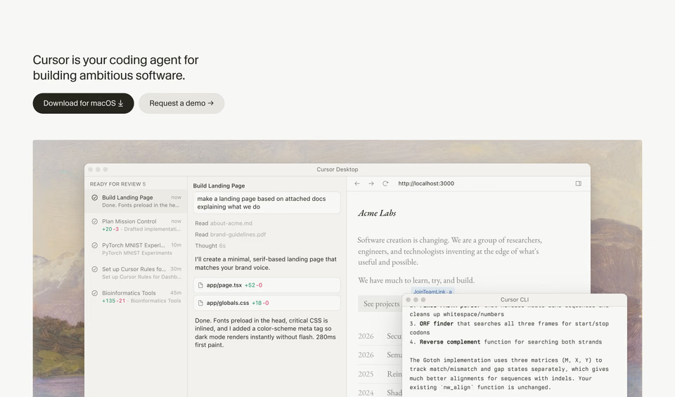

The headline stays small. The app and its terminal sit on a framed oil landscape, which brings all the colour on the screen.
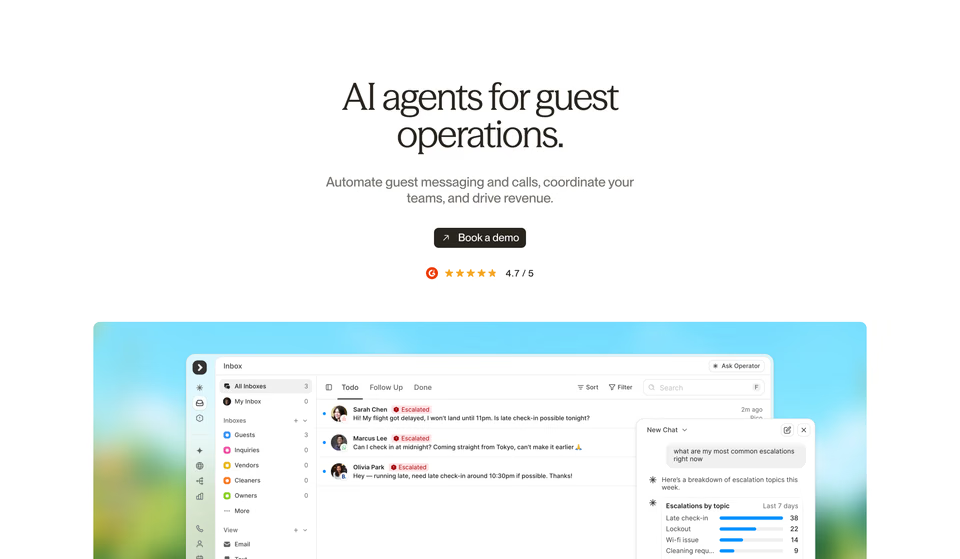

A serif headline, one button and a review score, then the inbox and its agent’s chat over a blurred summer photograph.
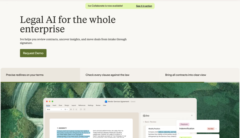
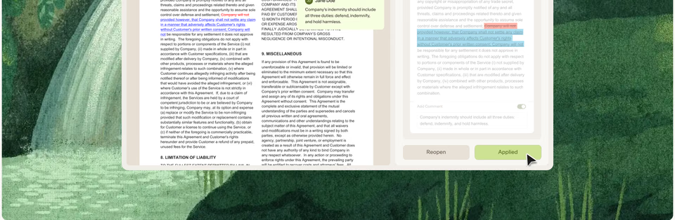
A serif headline, an olive button and three tabs, then the contract editor over a painted waterfall. Legal software that feels unhurried.
What to take: the product, real and large, early. A picture chosen for the brand rather than for the category. And a typeface for the headline with a voice of its own: two of the three set it in a serif. More openings like these are on our hero sections page.
How do you show a model or an API that has no screen?
Infrastructure has nothing to screenshot, so the strong pages show what it does instead: what it’s made of, how it works at scale, or how it beats the alternative. Each of these is a picture of the product that only this product could have.
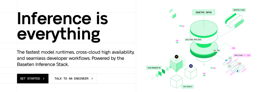
Baseten draws its stack as an isometric line drawing, labelled like a spec sheet, on a dashed grid. The drawing is the product shot.
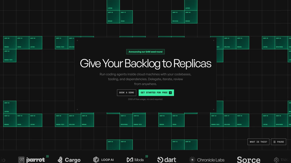

The page is a grid of agents: cells light up as named agents at work around one centred headline.
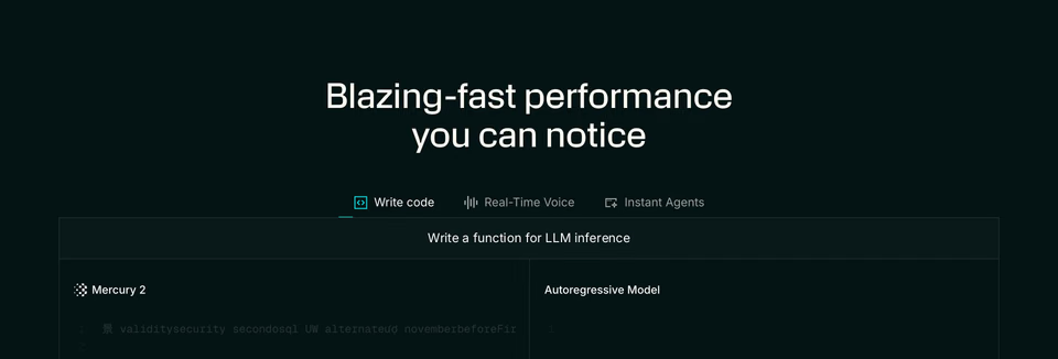
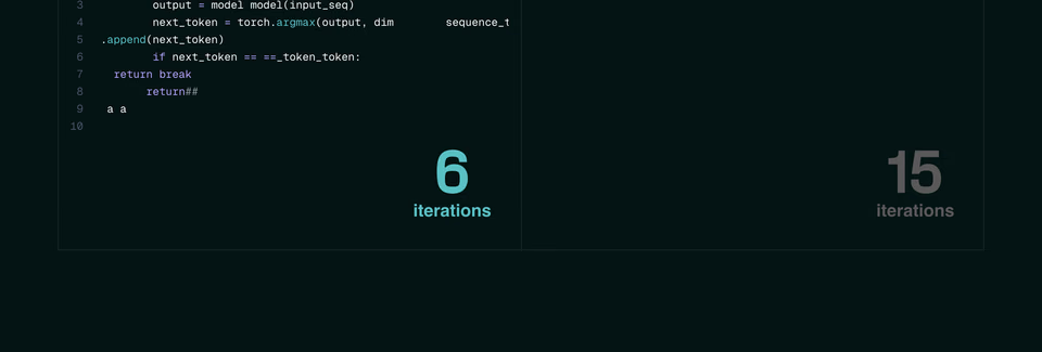
Two panes write the same function, one model against another, and the iteration counts settle it. Speed shown, not claimed.
What to take: one picture of how your product works, drawn for your product. A race, a stack or a grid of agents says more than a word like “fast” or “scalable” in the headline.
How do you show an agent doing the work?
An agent’s product is what it does on its own, so the strongest pages let you watch it, or try it, before you sign up. These three do it in the hero or right under it:
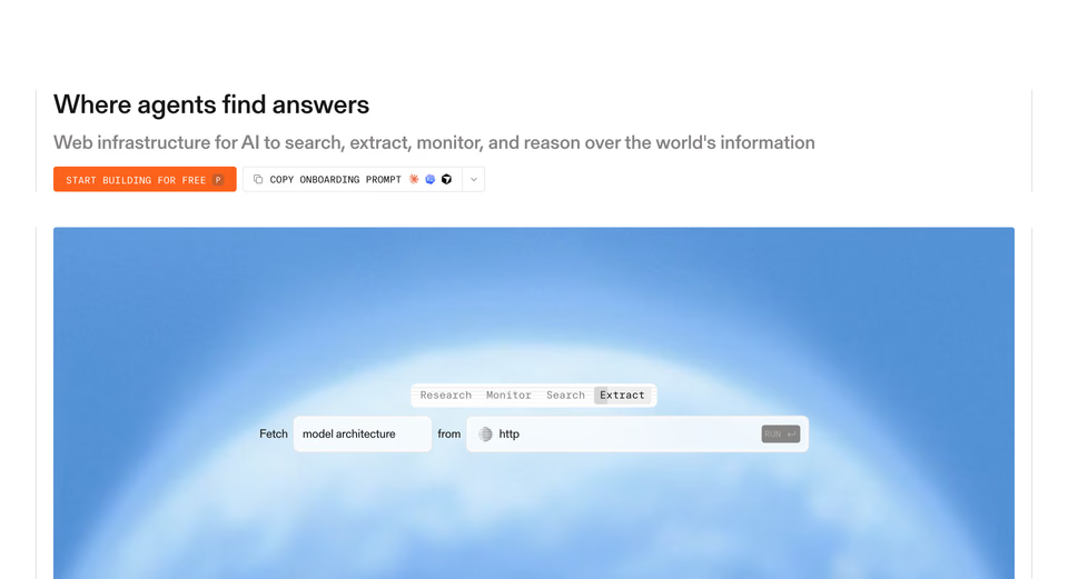

The API as a sentence to fill in, “Fetch … from …”, with a tab for each product, over a soft film of cloud.
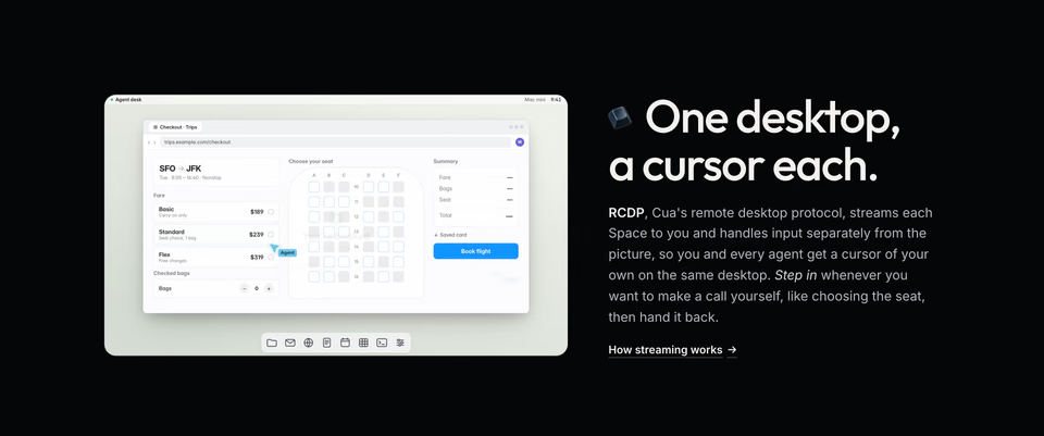
A looping desktop where an agent’s cursor fills in a flight checkout beside yours, explained in one paragraph.
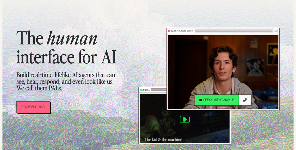
A serif headline beside two retro desktop windows, one a live video call with the agent, over a dithered pixel landscape.
What to take: one task, shown from start to end, in the product’s own interface. A form the agent fills in, a sentence the visitor completes, a call they could answer. For more ways to show a product, see our feature sections.
How do AI startups earn trust?
Anyone handing work to an agent wants to know two things: what it won’t do without asking, and who already trusts it. The pages we keep answer both with something you can see, rather than a row of badges.
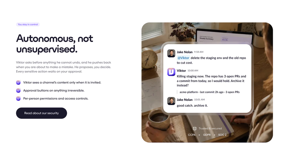
Trust as a scene: in a chat, the agent stops before deleting a repo and asks. The compliance badges are there, kept small.
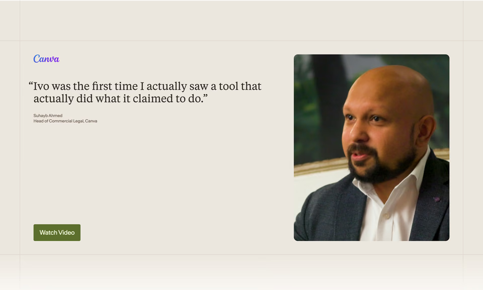
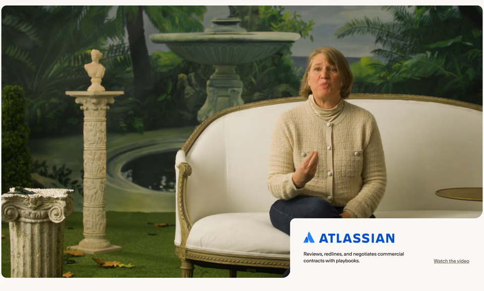
Customers on camera: a serif pull quote beside a portrait video, then a full-width interview filmed on a painted garden set.
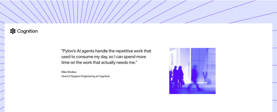
One quote, one photograph and one logo, framed by lines radiating in the brand’s violet. Nothing else to read.
What to take: say what the agent asks before doing, in the product’s own words, and let one customer talk, with a face. More on our testimonial sections page.
How should an AI startup show its pricing?
AI is sold by usage, and usage is hard to picture. The pricing we keep names the unit people actually buy, in the headline, and makes it easy to see what a month of it costs.
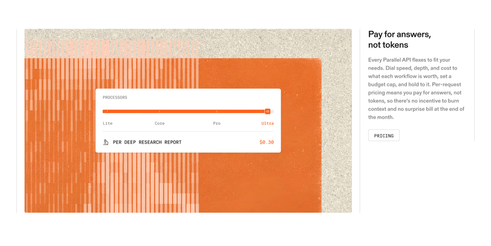
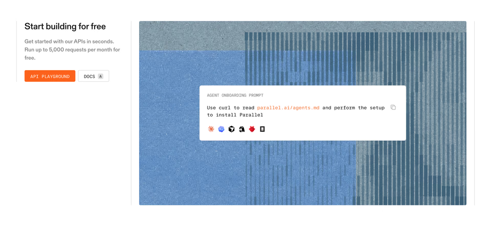
“Pay for answers, not tokens”: a slider from Lite to Ultra prices one research report, on a torn-paper collage.
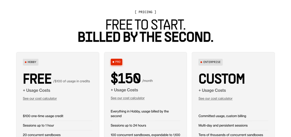
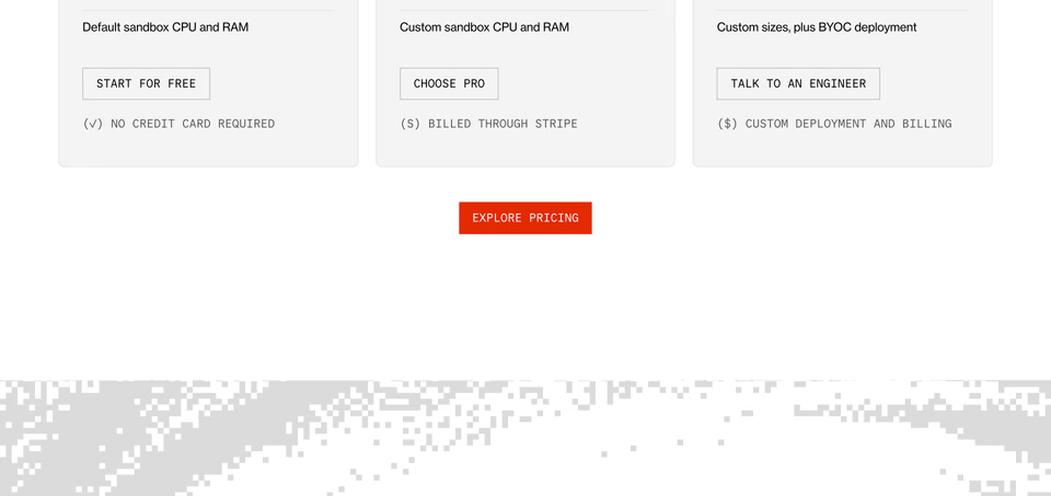
The unit is the headline, billed by the second, over three plain cards with the usage costs written under each price.
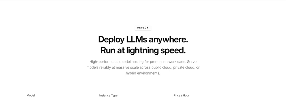
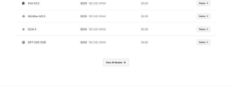
Pricing as a menu: each row a model, the machine it runs on, its price an hour and a button to deploy it.
What to take: one unit, named plainly, and one worked example of what it costs. Other approaches, from plain rows to a single plan, are on our pricing sections page.
How do you brief your agent for an AI landing page?
Give it references, not adjectives. Asked for “a landing page for my AI startup” with nothing to look at, a coding agent makes the page it has seen most often, which is the one this post is trying to avoid. Brief it part by part instead, the way the searches above are written, and ask for references before any code:
- Hero: the product, large, over a painting or a photograph that suits the brand; a serif headline; a light page; no purple gradient, no glowing orb.
- How it works: one task from start to end in the product’s own interface, not three icon cards.
- Trust: what the agent asks before acting, as a scene, and one customer quote with a face.
- Pricing: the unit in the headline, one worked example, at most three plans.
Over MCP, Claude Code, Cursor, Codex and other agents can run those searches in regards themselves, see each
section and read the page around it, and say what they take from each before they design. Agents come with
every plan, Free included, and the free plan searches all 3,070+ sections, 10 searches a day. The design skill makes the research a step your agent takes every time:
The references get you to a direction fast. The rest is still yours: which ideas to keep, then the type, the spacing, your own picture and the details no search returns, by hand, in Figma or in code. For the setup in each agent, see website inspiration for Claude Code, Cursor and Codex; for what gives an AI-made page away, how to make a website look less vibe coded.
Where can you see more AI company websites?
Whole sites, picked by hand, are on our AI website design page, next to the SaaS one. Every part of a page has its own collection, from navigation to calls to action and footers, all listed under website sections. Which sections AI companies’ home pages hold, and in what order, is counted in landing page sections, by the numbers. To compare the libraries that keep sections like these, see website section libraries, compared.
FAQ
What makes a good AI startup landing page?
The product, real and large, on the first screen, set on something with a point of view rather than a glowing gradient. Then one task shown from start to end, what the agent asks before it acts, one customer with a face, and pricing in the unit people buy. The pages we keep show these rather than claim them: a race between two models says fast better than the word does.
How do I make an AI startup website not look generic?
Replace the defaults with decisions: a painting, a photograph or pixel art behind the product instead of a purple glow, a headline typeface with a voice of its own, often a serif, and your own product in every section rather than icons. Brief your coding agent with real sections that carry the look, not adjectives.
How do you show an AI product that has no interface?
Show what it does. Baseten draws its inference stack as a labelled line drawing, Replicas fills its hero with a grid of agents at work, and Inception races its model against another writing the same function. Each is a picture no other product could use.
Where can I find AI startup landing page examples?
On regards, the AI website design page gathers AI companies’ sites picked by hand for their look, and every part of a page has its own collection, from heroes to pricing. You can also search 3,070+ sections by describing what you want, like “hero with the product over a painting, not dark”, or let your coding agent search them over MCP.