Landing page animation ideas and examples, part by part, from real sites
What to animate on a landing page and what to leave still, from the navigation bar down to the footer, each part with a real one recorded on a live site and how long it runs, then how much motion is too much.
The short answer
Animate what a visitor uses or needs to understand, and keep the rest still or slow: a navigation bar whose menus open quickly, a hero with the product working in it or one slow loop, features that show the product doing its job as they come into view, a pricing toggle that changes the prices as you flip it, and buttons that answer the pointer. Keep hover and click responses to a few hundred milliseconds, let things leave faster than they arrive, and never make anyone wait for the page. The examples in this guide come from  regards: 430+ interactions recorded on 130+ sites picked by hand for their look. Of the 431 counted on 17 November 2026, about a fifth are a product’s own interface moving in a mockup.
A fade on every block makes a landing page feel slow and samey. The sites below put motion where a visitor acts or needs to see the product work, and keep the rest still.
So this guide goes down a landing page the way a visitor does, from the navigation bar to the footer, and for each part
shows what hand-picked sites animate there, with a real one recorded on a live site and how long it runs. They come
from regards.design: 430+ interactions recorded on 130+ sites picked by hand for how they look, searchable by
what they do. Each one was filmed on its live page at 60 frames a second and timed frame by frame.
What should a landing page animate?
A landing page should animate what a visitor uses or needs to understand (its menus, the product in the hero, the feature screens, the pricing toggle, its buttons) and keep the rest still. The parts below are in the order our landing page sections study found them on home pages; beside each is what hand-picked sites animate there, and the rule they keep.
| Part | What to animate | The rule |
|---|---|---|
| Navigation bar | Menus that open fast and change shape as you move along | Leave the bar itself still |
| Hero | The product working in a mockup, or one slow loop behind the words | One thing to watch, never a wait |
| Logos | A slow marquee, or a hover that offers the customer stories | Keep logos readable |
| Features | Product screens that fill in or play as they come into view | Once, not on every scroll |
| Pricing | A toggle that changes the prices as it flips; a checkout shown working | Keep the numbers readable |
| Testimonials | A quiet hover, or words that light up as you read | Keep the quote still |
| Call to action | A button that answers the pointer | Keep the label readable |
| Footer | A small flourish, if anything | Keep the links still |
regards, read 17 November 2026.Of the 431 interactions in regards on 17 November, recorded on
sites picked for how they look, 90 are the product’s own interface moving in a mockup: about a fifth of all the motion,
more than any other kind of thing that moves.
| What moves | Interactions | Share |
|---|---|---|
| Product interface in a mockup | 90 | about a fifth |
| Canvas drawn live (backgrounds, 3D, particles) | 61 | about a seventh |
| A whole section coming into view | 46 | about a tenth |
| Menus and navigation | 44 | about a tenth |
| Cards | 41 | about a tenth |
| Buttons | 33 | about one in thirteen |
| Heroes as a whole | 29 | about one in fifteen |
regards by what moves, 431 in all, counted on 17 November 2026. Menus and navigation together; the rest are links, tabs, text, logos and other parts. These describe the library, mostly product sites picked by hand, not the web at large.How should the navigation bar move?
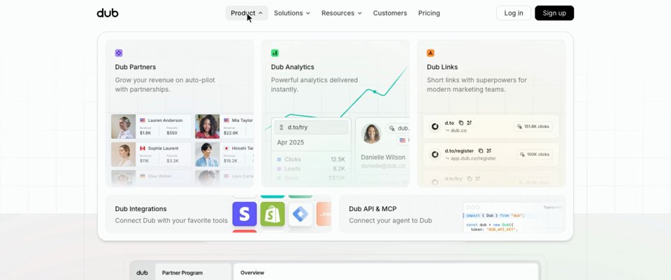
A landing page’s navigation bar should open its menus quickly and change their shape as the pointer moves along it, rather than closing and reopening. Dub’s panel fades in over 200 ms, swaps its contents in 150 ms and closes faster than it opens. Hand-picked bars without motion are on our navigation bars page.
A menu that follows you along the nav
The grey pill glides between labels on a spring (stiffness 400, damping 30), going a hair past each one before it settles, and the panel follows it.
Which hero and background animations work?
Hero and background animations work when one thing in the hero asks to be watched, ideally the product working in a mockup, and anything else changes slowly. A mockup that works on its own says what the product does faster than a sentence; a slow loop behind the headline keeps the page from looking printed. Two things asking to be watched compete, and an intro that holds the page back makes everyone wait. More heroes, without motion, on our hero sections page.
The product, playing itself
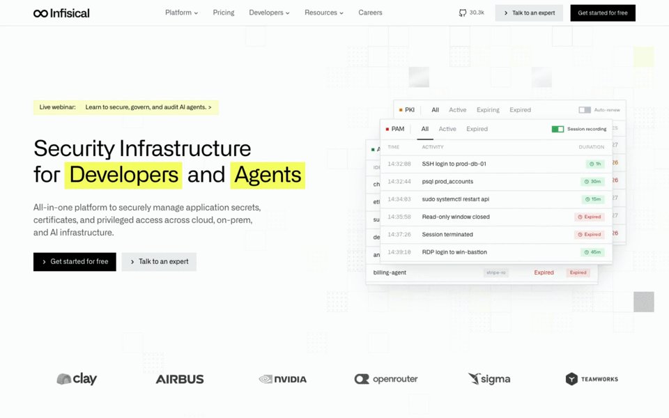
The cards shuffle over about half a second on an ease-out, then rest for a few seconds before the next.
One slow loop
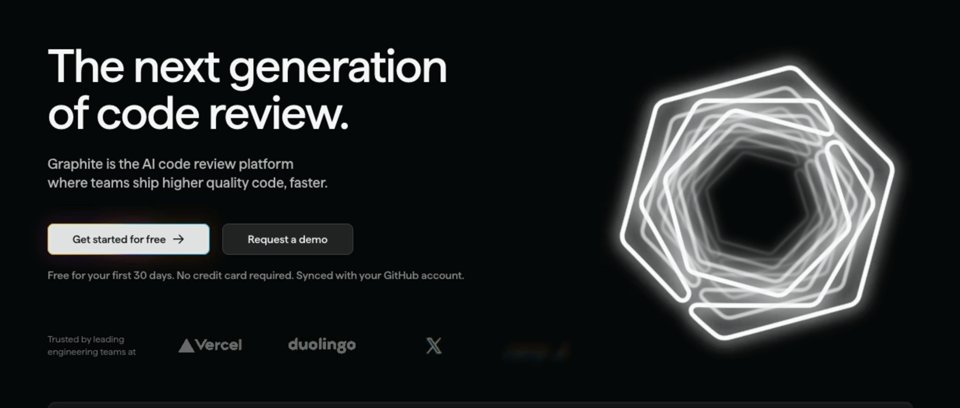
The shape turns on its own, and each logo dissolves through a blur in under a second, a quarter of a second after the one before, a slow ripple along the row.
Should the logo strip move?
A logo strip can move, as long as the logos stay readable: a marquee that drifts at a slow, constant speed reads as calm, and one that races reads as noise. Or make the row a link: on hover, offer the customer stories. More on our logo sections page.
Logos that lead somewhere
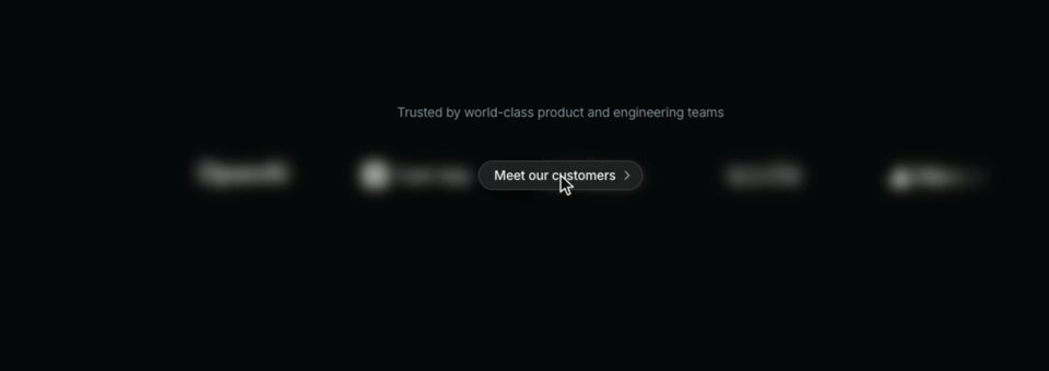
The row blurs to 8 px in 200 ms and the button fades and grows in over 250 ms, then both undo just as fast when you move away.
How should features come in?
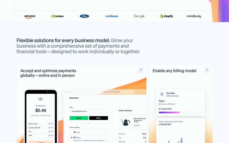
Features should come in by showing the product doing the job each one describes: a screen that fills in, a chart that draws, a count that ticks up as the grid comes into view. That says more than an icon and a sentence. Play it once as it arrives, not every time someone scrolls past. Feature grids without motion are on our feature sections page.
Screens that fill in as they arrive
The panel covers half its travel in about 150 ms and glides the rest of 600 ms, and the count follows.
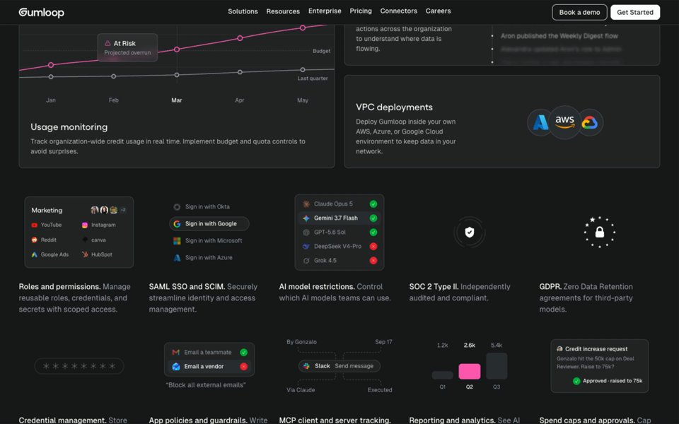
Tiles that keep working
Each change is a short ease-out, about 200 ms, with long pauses between.
Should pricing move?
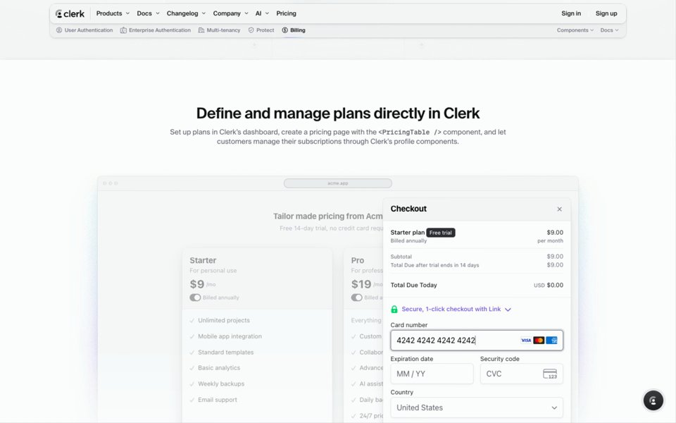
Pricing should move only to help the decision. A monthly and yearly toggle that changes the prices as it flips shows the yearly price at the moment of choosing; a checkout shown working answers “what happens next”. The numbers themselves should be readable at once. Pricing tables without motion are on our pricing sections page.
A checkout, shown working
The panel slides in 40 px over 300 ms on a plain ease-out while the table behind it dims, then the card number types itself in over about a second.
Should testimonials and calls to action move?
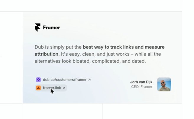
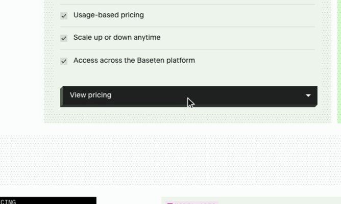
Testimonials and calls to action should move a little, and only when touched. A quote should never slide away while someone is reading it; a hover can show the customer’s own links or story. The button that closes the page should answer the pointer within a few hundred milliseconds, like Baseten’s below, because it’s the one people are meant to press. Hand-picked testimonial sections and calls to action show the layouts these sit in.
A testimonial that offers more
The swap takes under 100 ms, so the links seem to have been there all along, and the way back is a touch softer, at 150 ms.
A button that answers
The face moves 5 px up and to the right over 400 ms on a curve that hesitates and then snaps.
Does the footer need motion?
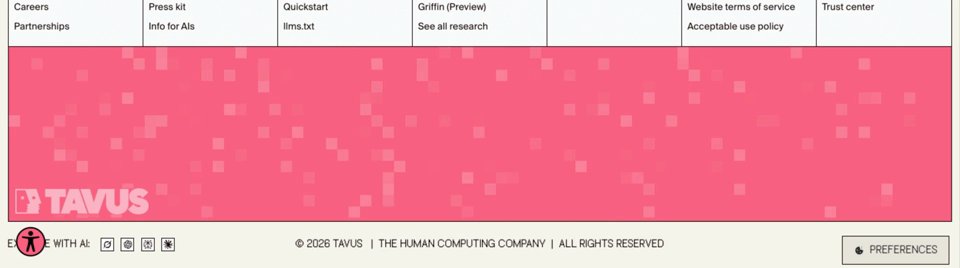
A footer rarely needs motion, and never in the way of its links. A slowly pulsing texture or a large logo at the very end is enough, as long as the links stay readable. Footers without motion are on our footer sections page.
A footer that breathes
Each cell rises to 40% and falls back on a slow six-second cycle; at that strength it stays behind the links above it.
What do hover animations do on phones?
Little or nothing. A phone has no pointer resting on things, so a hover effect either never plays or plays on a tap and sticks, and anything a hover reveals, a link, a story, a price, has to be reachable another way: by a tap, or by being there already. Scroll reveals and loops still play on a phone, on a smaller screen and a slower processor, so keep them fewer and lighter there.
Do landing page animations increase conversions?
We haven’t found a public test that shows it. Figures like “up to 30% more conversions” go round without a test behind them, and we haven’t measured it either. Use motion to explain the product and answer clicks, and test any change that makes the page slower to show or to use.
How much animation is too much, and what should you avoid?
Animation is too much when the page makes a visitor wait or watch. The common faults: every block fading up on scroll at the same speed, a loop in every section, a preloader in front of a marketing page, scrolling that is taken over and slowed down, and motion on things nobody touches. A good test is one thing per screen that asks to be watched, and motion wherever the visitor’s hand already is. Animating transform rather than size or position also keeps the page from shifting under the reader, which Google counts against a page as layout shift. Anyone who has asked their device for less motion should get a page that holds still.
To name what you want, see our guide to website animation names; to have a coding agent make it, our website animation prompts, written from measured timing. For an AI startup’s page, part by part without the motion, our guide to AI startup landing page design; and more animation picked by hand is on our website animation examples page.
FAQ
What are the best animations for a landing page?
The ones that show the product or help someone use the page: a product mockup that plays itself, a feature grid whose screens fill in as it comes into view, menus and tabs that answer quickly, a pricing toggle that changes the prices, and a button that answers the pointer. A slow loop behind the hero, a logo marquee and a quiet footer flourish are optional.
What website animations should I avoid?
The ones that make people wait or watch: a preloader in front of a marketing page, every block fading up on scroll at the same speed, a loop in every section, scrolling that is taken over and slowed down, and motion on things nobody touches. Aim for one thing per screen that asks to be watched, and keep the page still for anyone who has turned motion off.
Do animations hurt page speed or SEO?
They can. Animating transform and opacity is cheap for the browser and doesn’t shift the layout, while animating width, height or position can count as layout shift in Google’s Core Web Vitals, and heavy video and WebGL canvases cost more to run. An intro that hides the page delays what a visitor sees first. Keep loops few and light, pause what is off screen, and offer a still version to people who turn motion off.
What makes a SaaS landing page feel premium?
Motion that is quick where people act and slow where nothing waits on it, menus that change shape to fit each menu, and the product itself moving in the hero. The navigation, the pricing toggle and the buttons get the same care as the hero.