What are the parts of a website called? A guide to section names
Every part of a page by the name designers use, top to bottom, with the other names it goes by, a real section from our library and how often well-made home pages have one, then how to name them when you brief a designer or a coding agent.
The short answer
From the top of a page to the bottom: the navigation bar, the strip of links along the top; the hero, the first screen with the headline, buttons and a picture; then sections named for their job, such as logos, features, testimonials, pricing, an FAQ and a call to action; and the footer, the band of links at the end. Of the 323 home pages in our study of landing page sections, from sites picked by hand for their look and counted on 9 November 2026, 78% have a hero, 72% a footer, 40% features and 42% a call to action. In a brief or a search, say hero or navigation bar rather than header, which can mean either. Each name is shown with a real section from  regards, the search engine for website sections: 3,070+ sections from 330+ sites, searched by you or your coding agent.
A brief goes faster when you can name the part of the page you mean. Designers name each part for the job it does, and the names are shared widely enough that “hero” or “footer” means the same thing in a brief, a Figma file and a prompt to a coding agent. The trouble is the handful of names that mean two things, and the dozen most people never learn.
Here is every part of a page by the name designers use, from the top down: what it is, the other names it goes by, one real section to show it, and how many home pages have one. Those shares come from our study of landing page sections, by the numbers, which counted the sections on 323 home pages of sites picked by hand for how they look, on 9 November 2026; so they describe well-made sites, not the web at large. Every share below links that study, which also sets out the order the parts usually go in.
Every example comes from regards.design, a search engine for website sections: 3,070+ sections from 330+
sites, each site picked by hand for its look, that you or your coding agent search in plain words. It’s the right pick
when you know which part you’re designing and want real, shipped examples of it.
What are the parts of a website called?
From the top: the navigation bar, the hero, then sections named for their job, such as features, logos, testimonials, pricing, an FAQ and a call to action, and the footer at the bottom. Most home pages in our study have a hero (78%) and a footer (72%); everything between is chosen page by page.
| Part | Also called | Home pages with one |
|---|---|---|
| Navigation bar | nav, navbar, menu, top bar, header | not counted |
| Hero section | header, masthead, banner, intro, above the fold | 78% |
| Features | features grid, benefits, bento grid | 40% |
| Feature in depth | feature block, feature spotlight, alternating rows | 22% |
| Product demo | product tour, interactive demo, walkthrough | 10% |
| How it works | steps, process, getting started | 9% |
| Use cases | solutions, who it’s for, industries | 11% |
| Integrations | apps, connections, works with | 10% |
| Comparison | comparison table, versus, why us | 3% |
| Security | trust, compliance, enterprise | 9% |
| Logos | logo strip, logo wall, logo cloud, trusted by, social proof | 25% |
| Testimonials | reviews, quotes, wall of love, social proof | 27% |
| Case study | customer story, success story | 7% |
| Stats | numbers, metrics, by the numbers | 9% |
| Pricing | plans, pricing table, pricing tiers | 9% |
| FAQ | frequently asked questions, accordion | 11% |
| Call to action | CTA, closing CTA, sign-up section | 42% |
| About | mission, our story, manifesto, who we are | 29% |
| Team | people, leadership, founders | 3% |
| Careers | jobs, open roles, join us | 2% |
| Investors | backers, backed by | 2% |
| Contact | get in touch, contact form | 4% |
| Blog | articles, news, resources, journal | 20% |
| Changelog | release notes, what’s new, updates | 3% |
| Community | events, forum, join the community | 8% |
| Work gallery | portfolio, selected work, projects, showcase | 42% |
| Footer | site footer, fat footer, bottom bar | 72% |
What is the top part of a website called?
Two parts, and their names get mixed up. The navigation bar is the strip of links along the top; the hero is the first screen under it. “Header” is used for both: in a page’s code the header element usually holds the navigation bar, while some designers call the whole first screen the header. Say navigation bar or hero and nobody has to guess.
Navigation bar
The strip along the top of every page with the logo, links to the main pages and a button or two, such as sign in and get started. It often stays in place as you scroll. A thin band above it carrying news or an offer is an announcement bar, and a menu that opens into panels of links is a mega menu.
Also called the nav, the navbar, the menu, the top bar or the header. Our landing page sections study leaves it out: it sits over the page rather than taking a place in its order. Hand-picked ones are on our navigation bars page.

Hero section
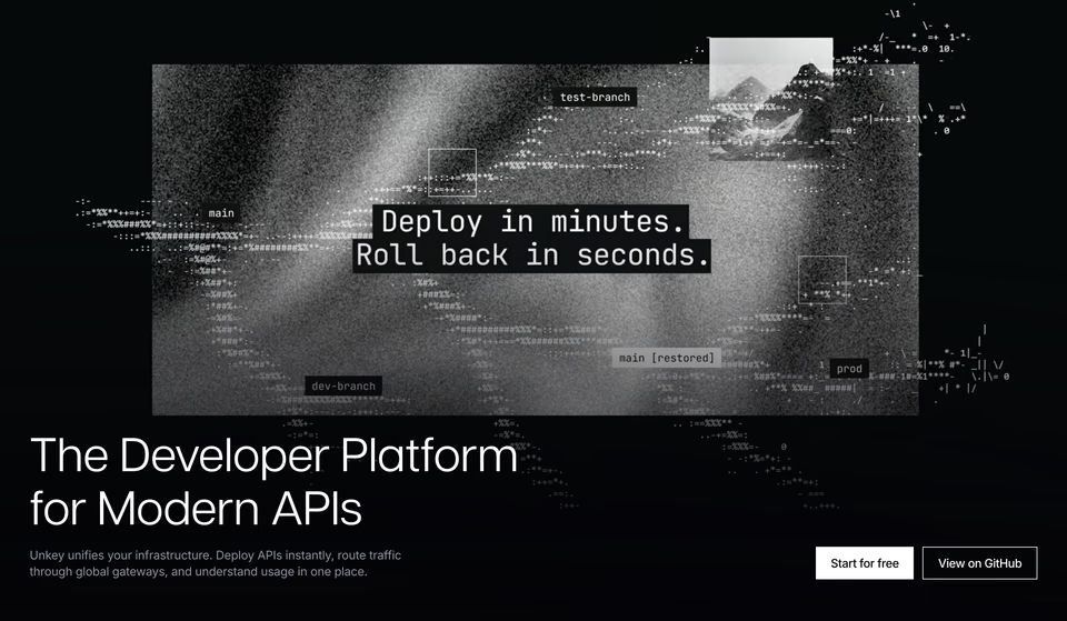
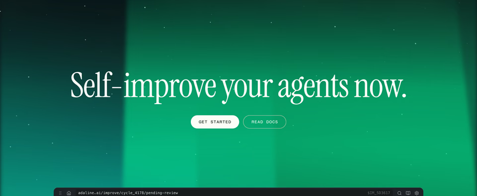
The first screen of a page: the headline, a line on what’s on offer, one or two buttons, and a picture, product shot or demo that holds them together. It’s what a visitor sees before scrolling, so it carries the most care.
Also called the header, the masthead, the banner or the intro; “above the fold” is the old newspaper term for what shows before you scroll. 78% of the home pages we counted have one, and 76% open on it. More on our hero sections page.
What are the sections that explain a product called?
They say what the product does, how, for whom and with what. Product sites put them in the upper middle of the page, straight after the hero or the logos.
Features
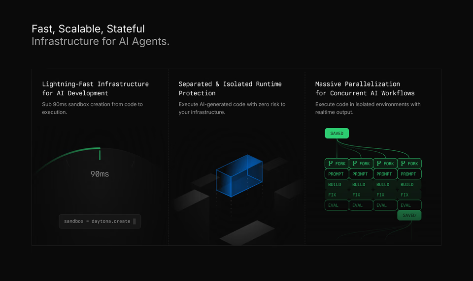
An overview of what the product does: a grid or a list of short blocks, each a heading, a line and an icon or a picture. When the blocks are tiles of different sizes fitted together, it’s called a bento grid.
Also called a features grid or benefits. 40% of the home pages we counted have one. More on our feature sections page.
Feature in depth
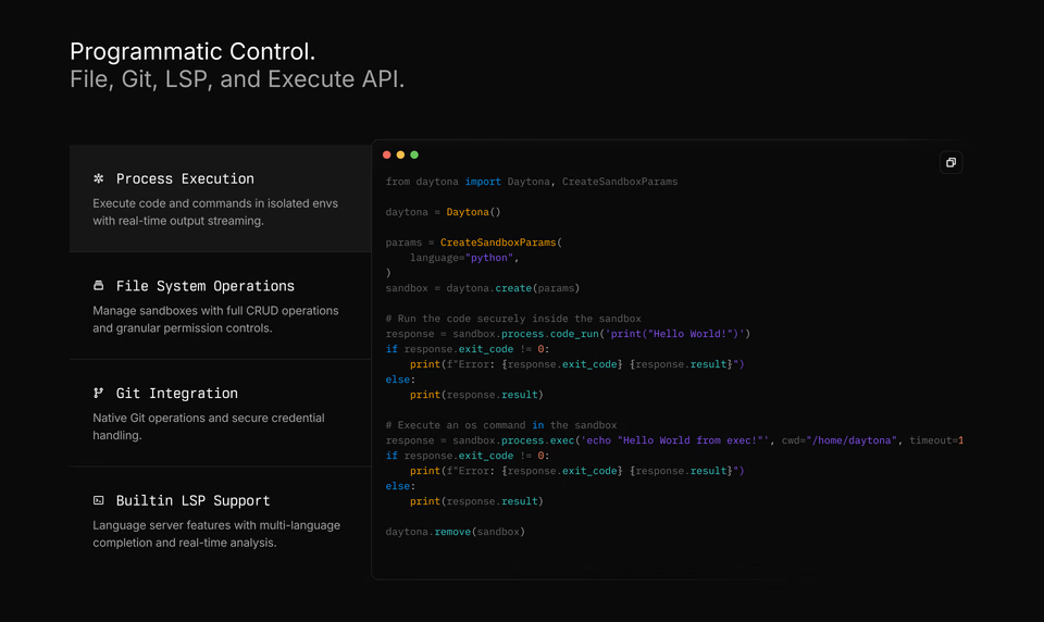
One feature given a section of its own: a heading, a paragraph and a button on one side, a picture of that feature at work on the other. Several in a row, words and picture swapping sides each time, are called alternating or zig-zag rows.
Also called a feature block or a feature spotlight. 22% of the home pages we counted have one.
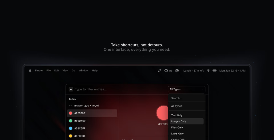
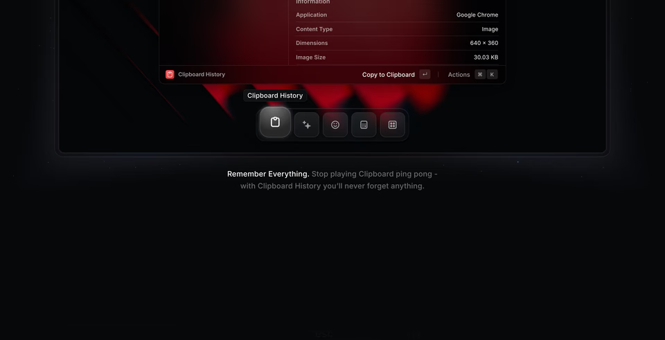
Product demo
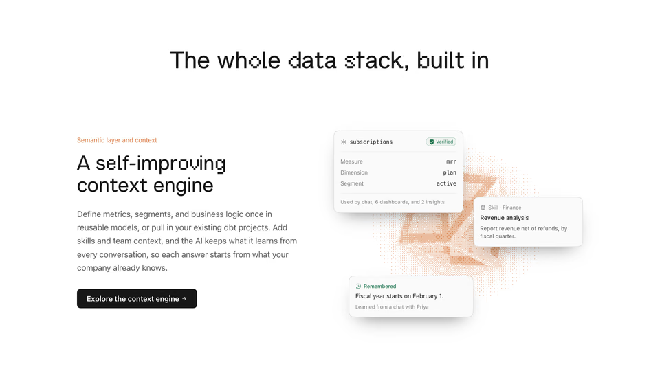
The product shown working, as a video, an animation or something you can click, rather than a still screenshot.
Also called a product tour, an interactive demo or a walkthrough. 10% of the home pages we counted have one.
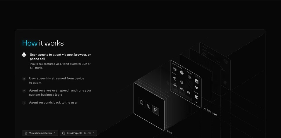
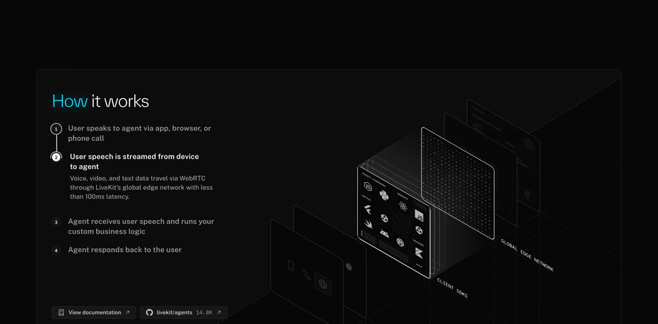
How it works
The steps it takes to use the product, or what happens inside it, in order: numbered steps, a timeline or a diagram.
Also called steps, the process or getting started. 9% of the home pages we counted have one.
Use cases
Who the product is for, or what it’s used for, by audience, industry or task, often with a tab for each.
Also called solutions, who it’s for, or industries. 11% of the home pages we counted have one.

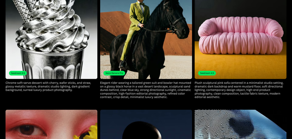
Integrations
The tools the product connects to, usually shown as their logos or app icons.
Also called apps, connections or “works with”. 10% of the home pages we counted have one. More on our integration sections page.
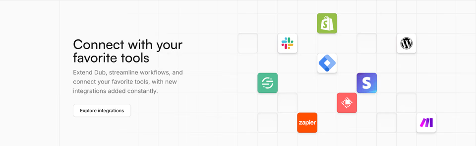
Comparison
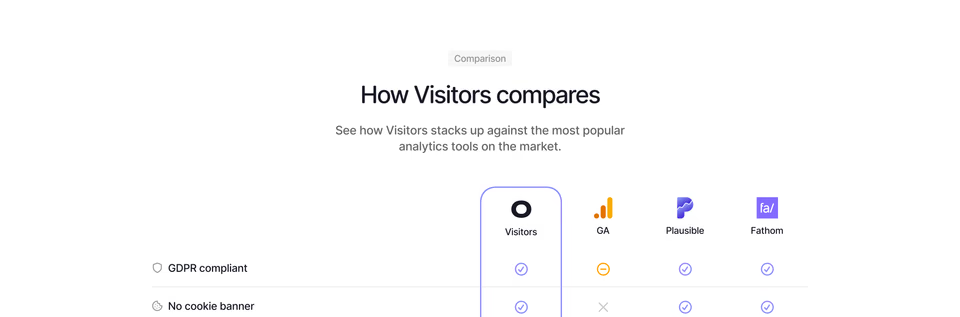
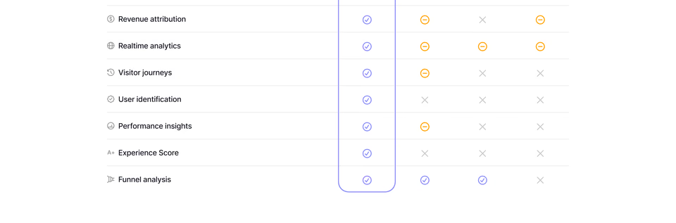
The product set against the alternatives, or its plans against each other, as a table of ticks and crosses.
Also called a comparison table, a “versus” section or why us. 11 of the 323 home pages we counted have one.
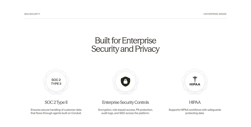
Security
What makes the product safe to adopt: certifications, compliance badges and how data is kept.
Also called trust, compliance or enterprise. 9% of the home pages we counted have one.
What are social proof sections called?
Social proof is the umbrella name for the sections that show other people already use the product. Each kind has its own name.
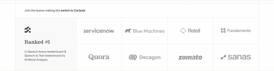
Logos
A strip or a wall of the logos of customers, partners or press, under a line such as “trusted by”. It comes high up: of the home pages in our study with something under the hero, 27% put logos straight after it.
Also called a logo strip, a logo wall, a logo cloud or “trusted by”. 25% of the home pages we counted have one. More on our logo sections page.
Testimonials
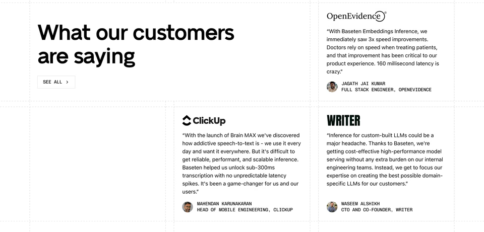
Customers’ own words: quotes with a name, a role and often a photo or a logo, set as cards, a carousel or a wall.
Also called reviews, quotes or, when there are many, a wall of love. 27% of the home pages we counted have one. More on our testimonials page.
Case study
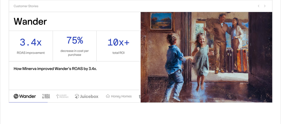
One customer’s story told with its outcome, usually in numbers, linking to the whole story.
Also called a customer story or a success story. 7% of the home pages we counted have one.
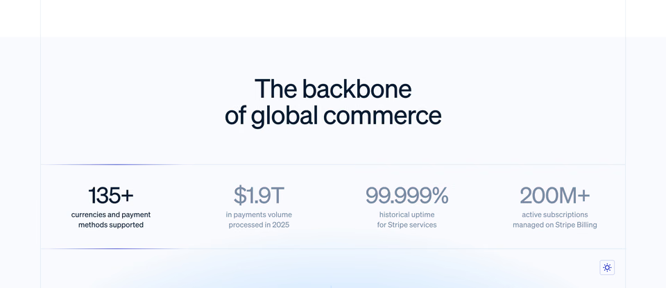
Stats
A few big numbers that show scale, such as customers, uptime or volume, each with a short label.
Also called numbers, metrics or by the numbers. 9% of the home pages we counted have one. More on our stats sections page.
What are pricing, FAQ and call to action sections?
The sections that help a visitor decide. They sit towards the end of a page, and the call to action is most often the last thing before the footer.
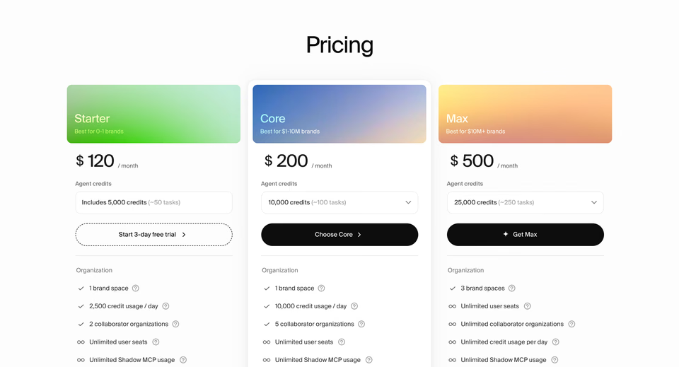
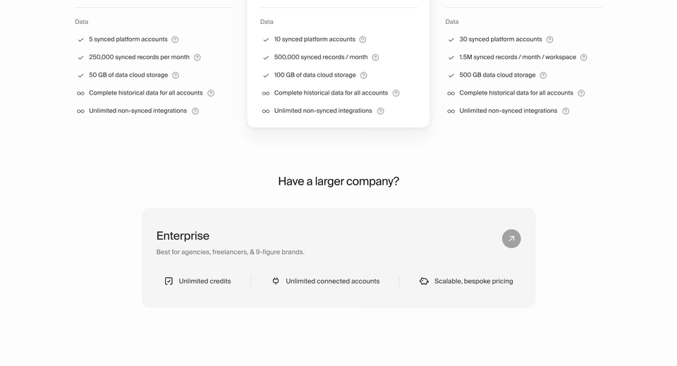
Pricing
The plans and what each costs, usually as cards side by side with what each includes, often with a switch between paying monthly and yearly.
Also called plans, a pricing table or pricing tiers. 9% of the home pages we counted have one; the rest leave prices off the home page. More on our pricing sections page.
FAQ
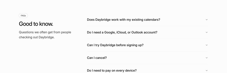
The questions people ask before they buy, each with its answer folded away until it’s clicked.
Short for frequently asked questions; the folding list is an accordion. 11% of the home pages we counted have one. More on our FAQ sections page.

Call to action
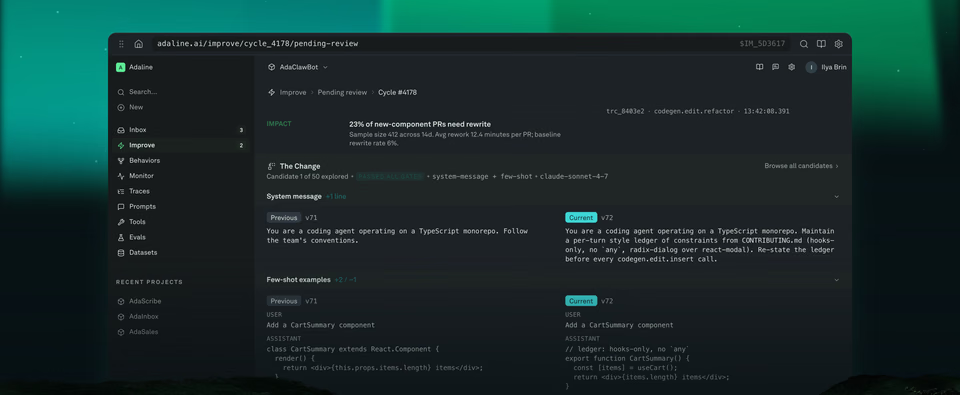
A short section that asks for one thing: sign up, start a trial, book a demo. A headline and one or two buttons, often on a colour or picture of its own.
Also called the CTA, the closing CTA or a sign-up section. 42% of the home pages we counted have one, and of the pages with a footer and something above it, 46% put a call to action straight before the footer. More on our calls to action page.
What are the sections about the company called?
Who is behind the product, how to join them and how to reach them. Studios’ home pages give them more room than products’ do.
About
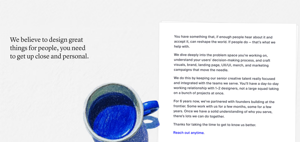
Who is behind the company and why: the mission, the story, the values, sometimes a letter from the founders.
Also called our story, mission, manifesto or who we are. 29% of the home pages we counted have one. More on our about sections page.
Team
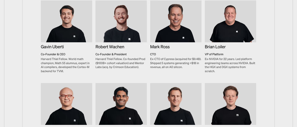
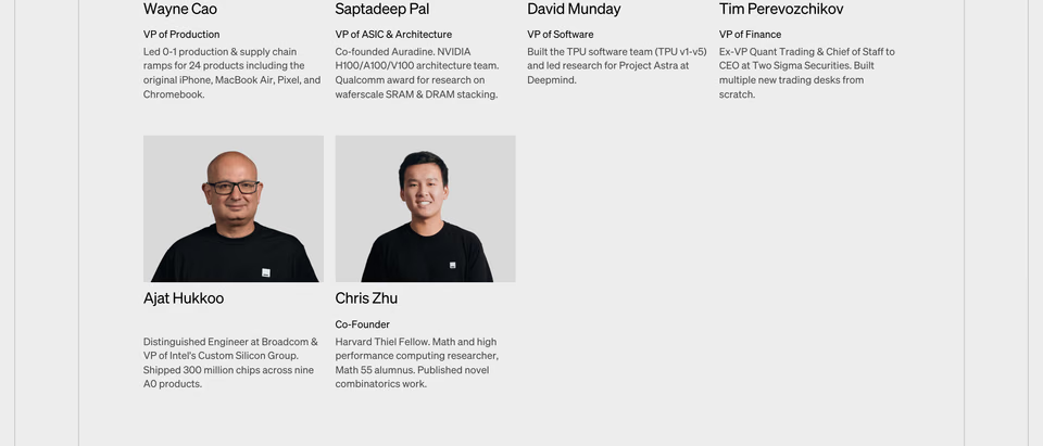
The people: portraits with names and roles, sometimes a line on each.
Also called our team, people, leadership or founders. 10 of the 323 home pages we counted have one.
Careers
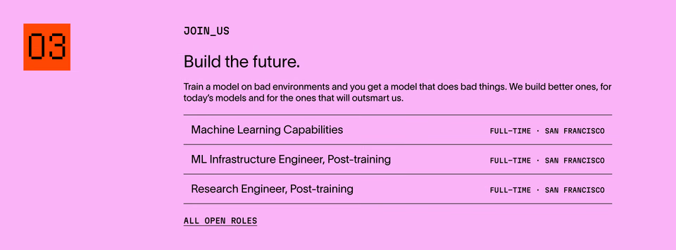
An invitation to work there, with the open roles or a link to them.
Also called jobs, open roles, join us or we’re hiring. 6 of the 323 home pages we counted have one.
Investors
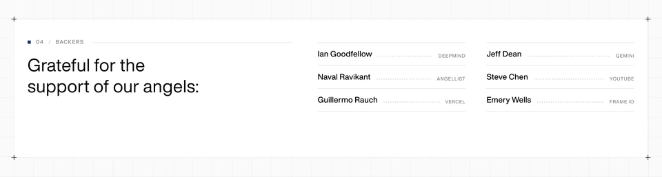
The firms and people who fund the company, as logos or names.
Also called backers or “backed by”. 5 of the 323 home pages we counted have one.
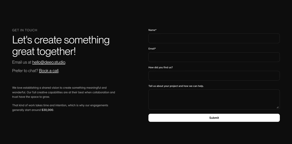
Contact
How to get in touch: an email address, a form, an office address or a link to book a call.
Also called get in touch or a contact form. 14 of the 323 home pages we counted have one.
What are the blog, changelog and community sections?
The sections that show a company is active: what it writes, what it ships and who gathers around it.
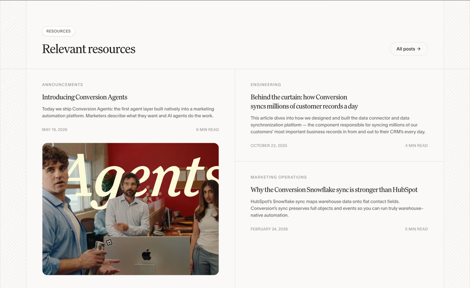
Blog
The latest posts or news, as cards linking to each.
Also called articles, news, resources or journal. 20% of the home pages we counted have one. More on our blog sections page.
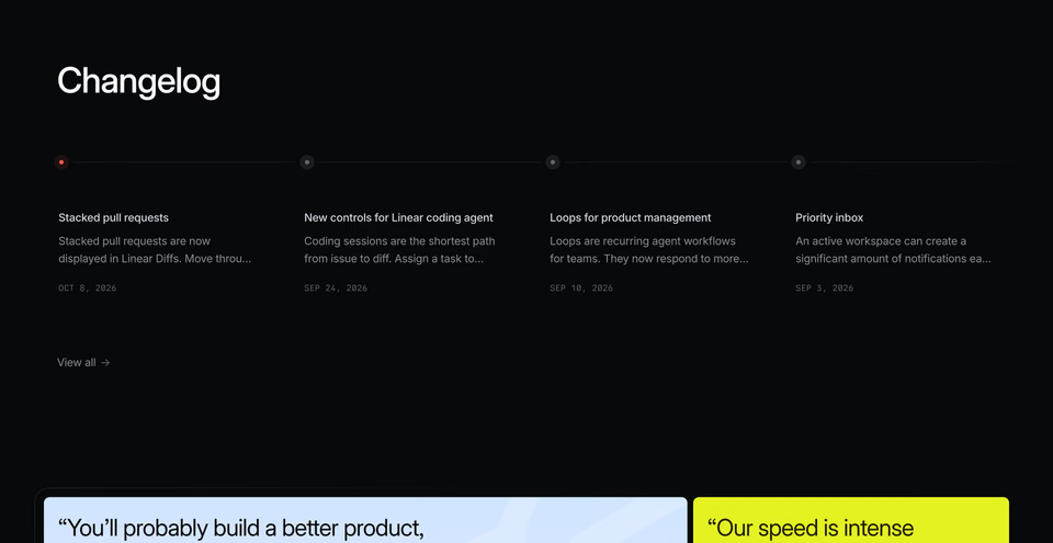
Changelog
The latest product updates, each with its date.
Also called release notes, what’s new or updates. 9 of the 323 home pages we counted have one.
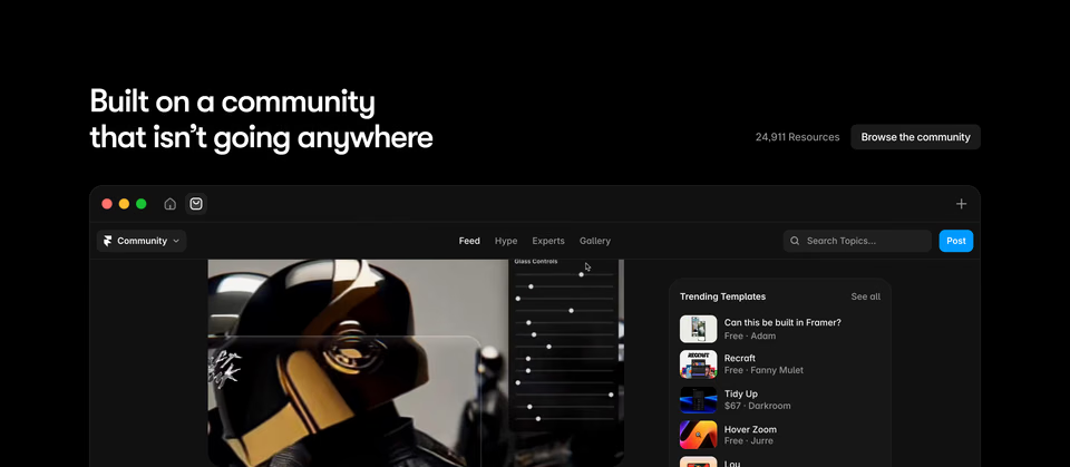
Community
Where the people who use the product meet and share: a forum, events, a chat server, templates and resources.
Also called events or join the community. 8% of the home pages we counted have one.
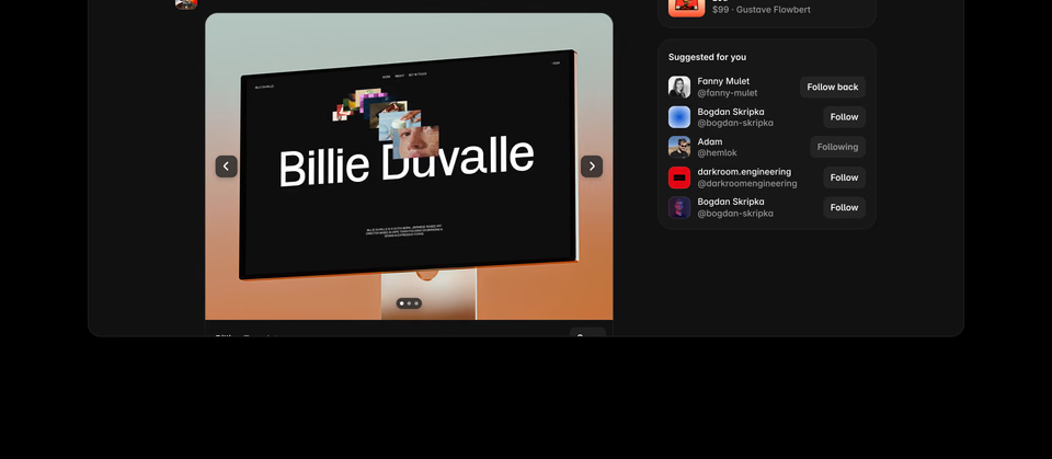
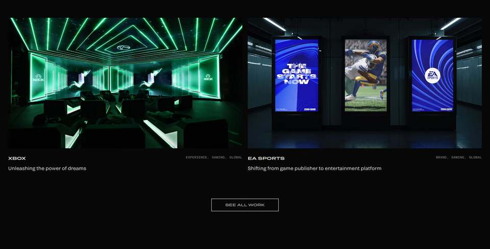
What is the part of a portfolio that shows the work called?
Work gallery
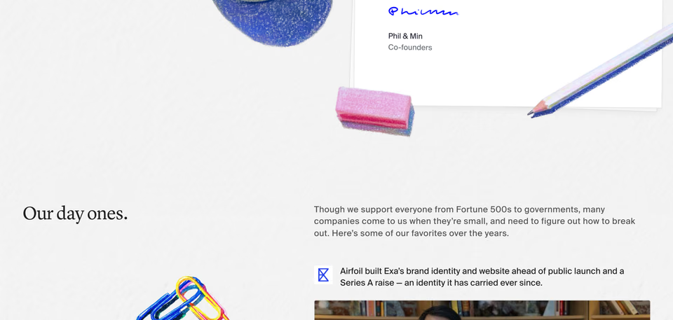
A studio’s or a designer’s projects, as large pictures that each open a case study. On their home pages it takes most of the room: galleries of work are 55% of the sections on the studio home pages we counted, and 59% on portfolios’.
Also called the portfolio, selected work, projects or a showcase. 42% of the home pages we counted have one. More on our portfolio sections page.
What is the bottom part of a website called?
Footer
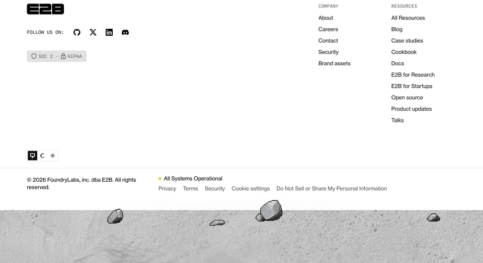
The band at the end of every page: links to the rest of the site in columns, legal links, social links, often a newsletter sign-up and the company’s name, sometimes set huge.
Also called the site footer, or a fat footer when it holds many columns of links; the thin line of legal links at the very bottom is the bottom bar. 72% of the home pages we counted have one, and 98% of those end on it. More on our footers page.
How do you name the parts when you brief a designer or a coding agent?
By the names above, one part at a time, then what goes in it and how it should look. “A hero with a serif headline, two buttons and the product on the right, on a light page” gets you something you can judge; “a nice header” gets you a guess.
It’s how people already search. Of the 619 searches people and their agents sent regards between 8 October and
6 November 2026, “hero” came up in 84, “header” in 4 and “masthead” in 2, and “above the fold” in none. The bar along
the top was “navigation” in 36 and “menu” in 17, “navbar” in none; the end of the page was “footer” in 17; and “call to
action”, in 15, came up more often than “CTA”, in 4. Agents wrote 20 words to an ask at the median and people 2, and agents
more often named several parts in one ask.
- Name the part, then its contents, then its look. “Pricing: three plans, the middle one raised, a monthly and yearly switch, flat and light.”
- Say what you don’t want. “No gradient, no stock photos, not dark” rules out more than another adjective adds.
- For a whole page, list the parts in order. The usual order is in landing page sections, by the numbers; start from it and cut.
- Point at real examples. A link to a section that does what you mean says more than any description of it.
To find those examples, search regards for a part the way you’d describe it, “an FAQ with the
heading on the left” or “a footer with the name set huge”, or browse the hand-picked ones on our website section examples page. Coding agents can search the same library over MCP, see
each section and read the page around it; our MCP docs show
how to connect yours. The free plan searches all 3,070+ sections, 10 searches a day.
Where do the names and numbers come from?
- The names. The ones designers use, matched to the kinds of section regards files every section
under. The other names are the ones people use in briefs, in code and when they search.
- The counts. From our study landing page sections, by the numbers: the home pages
of 323 websites as regards held them on 9 November 2026, one page a site, each site picked by hand for how it looks, cut into 2,482 sections. A share is the home pages
holding at least one section of that kind. The navigation bar is left out of every count. These are shares of our
library, not of the web.
- The examples. One section of each kind, picked by looking at the home pages counted, none of them already on our collection pages, with our note on what to see in each. A section that leaves the library drops out of this page.
- The words people search with. Searches sent to regards from 8 October to 6 November 2026, by
people on the site and by their agents, each account’s search counted once and our own left out, counted by the
words in them. We read the counts, not who searched.
FAQ
What is the top part of a website called?
The navigation bar: the strip along the top with the logo, links to the main pages and a button or two, also called the nav, the menu or the header. Under it is the hero, the first screen of the page, with the headline, a line on what is on offer, one or two buttons and a picture. Designers also call the hero the masthead, and what shows before you scroll is above the fold. 76% of the 323 home pages in our landing page sections study open on a hero.
What is the bottom part of a website called?
The footer: the band at the end of every page with links to the rest of the site, legal and social links, and often a newsletter sign-up. 72% of the 323 home pages in our landing page sections study have one, and the section straight above it is most often a call to action. A footer with many columns of links is a fat footer; the thin legal line at the very bottom is the bottom bar.
What are the sections of a landing page called?
The hero, logos, features, testimonials, a call to action and the footer, most often, with pricing, an FAQ, integrations, stats, how it works and a product demo where the product needs them. Of the 51 SaaS home pages in our landing page sections study, 73% have features, 57% testimonials and 84% a call to action, and they usually go hero, logos, features, testimonials, call to action, footer.
What is the difference between a header and a hero section?
Header is used for two things. In a page’s code, the header element usually holds the navigation bar, while some designers call the whole first screen the header. The hero is that first screen itself: the headline, buttons and picture under the navigation bar. Say navigation bar or hero to be clear. In the searches people and their agents sent regards from 8 October to 6 November 2026, “hero” came up in 84 and “header” in 4.